Vending Machine
An emotional customer-journey audit for "Auto-Compra," a self-service smartphone vending kiosk for Movistar.
- Role
- Lead UX Designer
A Kiosk Nobody Had Mapped Emotionally
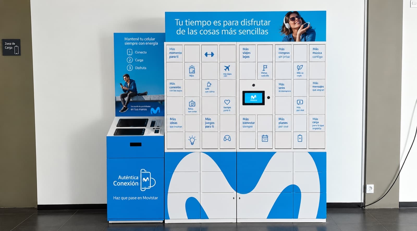
Auto-Compra is a self-service kiosk where a customer buys a smartphone start to finish — choose a device, verify identity by fingerprint, pay, and collect it from a locker — with no staff involved. This audit walked the full experience touchpoint by touchpoint to find where it built trust and where it lost it.
Approach
The audit walked the entire journey — from first approaching the kiosk to testing the phone at home — and tagged each of 13 touchpoints with the emotion it actually produced, from "high expectation" through "frustration" to "happy." Each touchpoint carried concrete interface observations, not just an emotional label, so the findings could translate directly into design changes.
What the Journey Map Found
Early touchpoints — approaching the kiosk, selecting a device — scored well; customers were curious and open. The dip came mid-flow: cramped forms, unclear validation, and a biometric step with unclear instructions all produced frustration or anxiety. The journey recovered sharply at the end — opening the locker and holding the new phone consistently registered as surprise and happiness, a moment the audit flagged as worth designing around more deliberately.
Interfaces
The kiosk
Auto-Compra in a public space — a touchscreen kiosk paired with a payment terminal for self-service checkout.
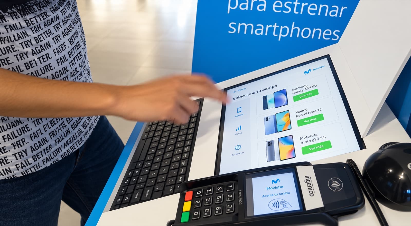
Selecting a device
A customer navigating the touchscreen catalog to choose a smartphone.
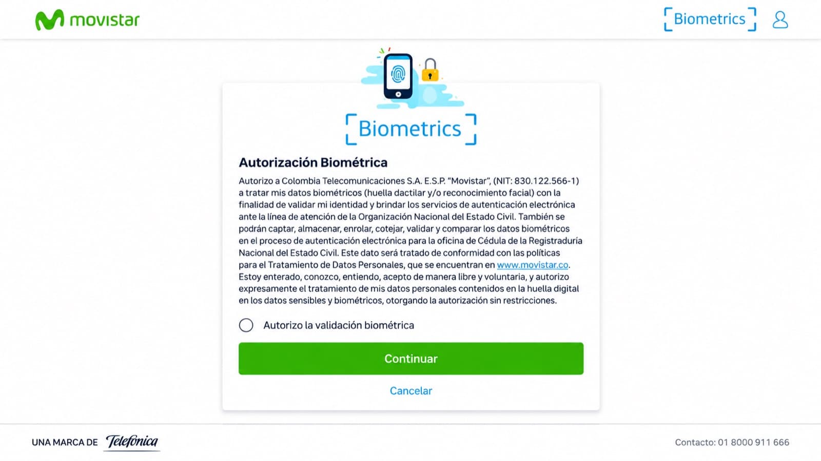
Biometric verification
The identity-verification step that produced the most visible anxiety in the journey audit.
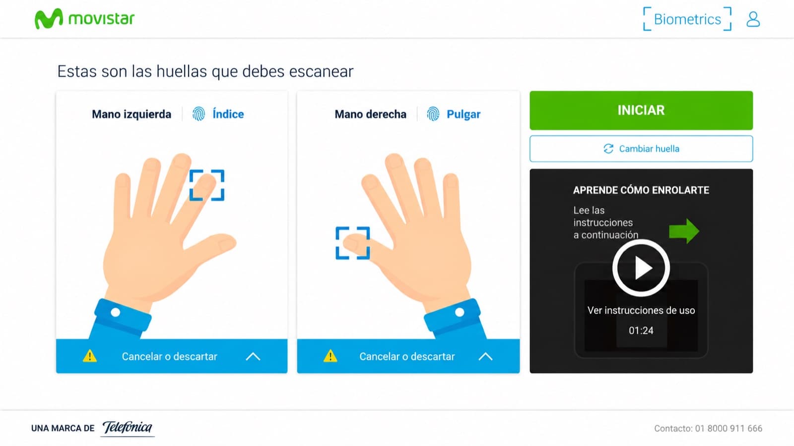
Fingerprint scan
Enrollment instructions for the fingerprint scan — one of the flow's least intuitive moments.
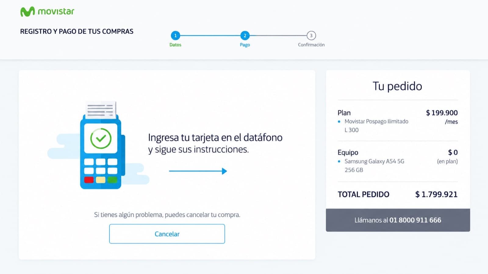
Payment confirmation
The card-payment step, where customers needed clearer feedback that the step had actually succeeded.
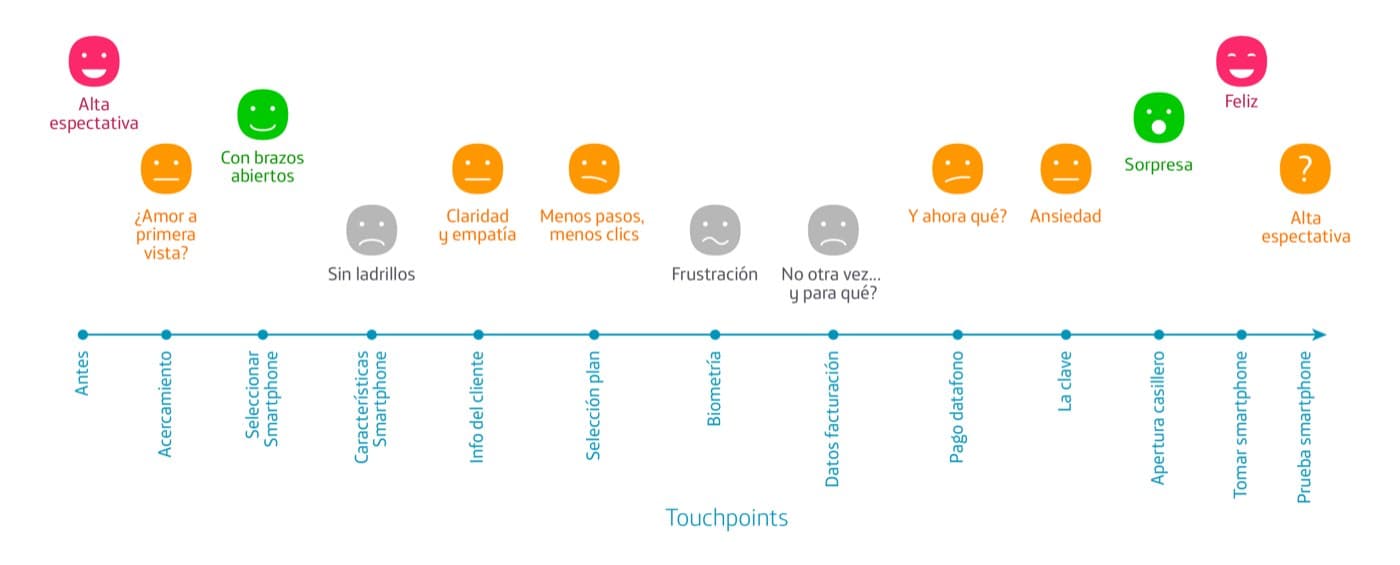
Emotional journey map
All 13 touchpoints, from first approach to testing the new phone, each tagged with the emotion it actually produced.
Impact
Reflection
Mapping emotion touchpoint by touchpoint made something obvious that a feature list would have hidden: the kiosk's biggest risk wasn't any single broken screen, it was the valley in the middle of the journey, between the initial curiosity of picking a phone and the payoff of holding it. Fixing that valley mattered more than polishing any one step in isolation.