Payment Landing (Movistar)
A redesigned bill-payment landing page for Movistar customers, integrating card and digital wallet payments through ePayco.
- Role
- Lead UX Designer
Paying a Bill Shouldn't Be a Puzzle
Movistar customers paying their bill online landed on a page built around internal billing categories — Movistar, or the legacy brands it had absorbed (Telebucaramanga, Metrotel) — rather than a simple, fast way to pay.
Approach
The landing page was redesigned around a single task — pay my bill — with the legacy-brand selector reduced to a lightweight toggle instead of the page's main decision. Payment methods (card, PSE, digital wallets) were consolidated and processed through ePayco, and the mobile flow was built as its own responsive path rather than a scaled-down desktop page.
How It Works
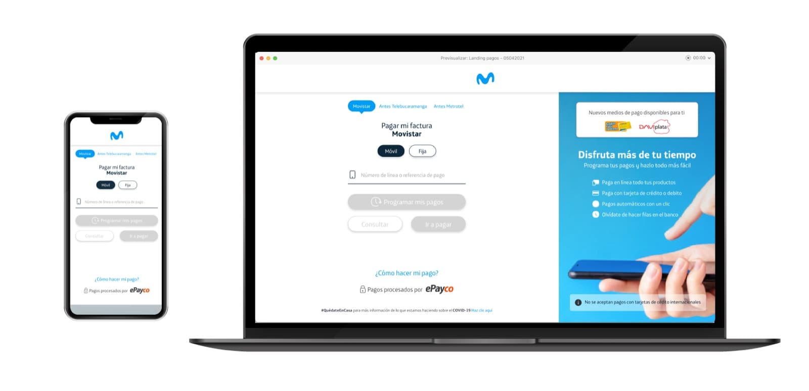
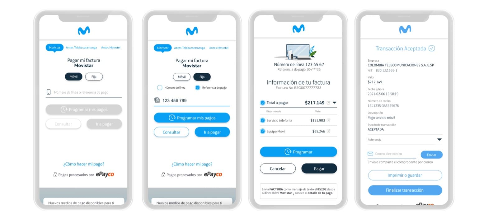
A customer lands on the page, confirms which line they're paying (mobile or landline), and enters their line number or payment reference. From there they can schedule a payment, check their balance, or pay immediately, with card and digital-wallet options surfaced directly on the page. The confirmation step shows the invoice and amount with a one-tap path to pay, plus an SMS-based alternative for checking payment details without logging in.
Interfaces
Bill payment
The main payment form — desktop and mobile, line lookup and a direct path to pay.
Payment confirmation
The mobile flow end to end — plan selection, payment method, and a confirmed transaction.
Mobile & desktop
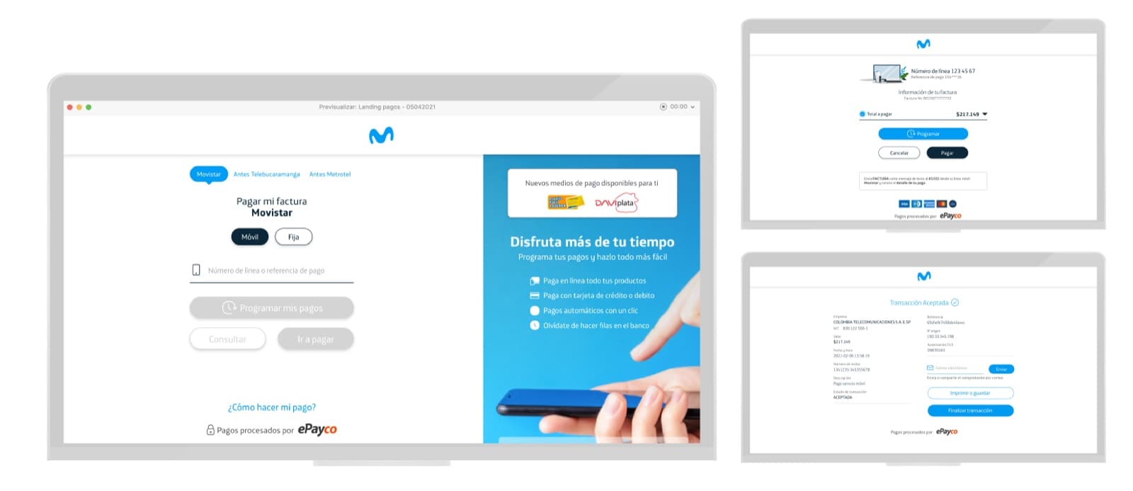
The same payment flow across devices, from a laptop checkout to a phone in hand.
Usability validation
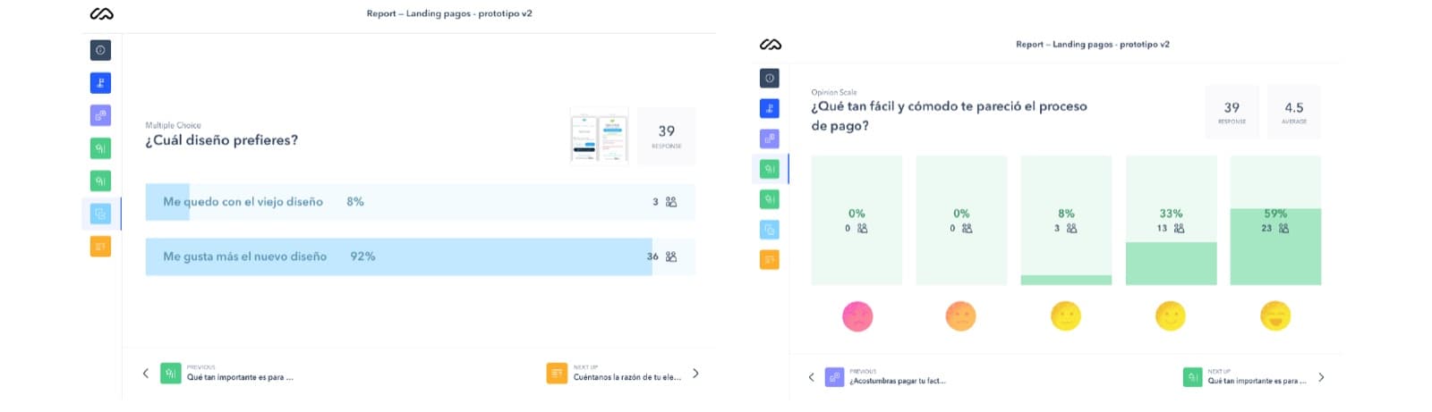
A Maze usability report on the redesign — 92% of testers preferred it over the old page.
Impact
Reflection
The obvious redesign would have been a visual refresh of the same page. The actual fix was demoting the brand selector from the main decision to a small toggle — customers didn't care which legacy system their line came from, they just wanted to pay, and the page finally reflected that.