Nuvola Platform
Refining the housekeeping and maintenance tools hotel staff use every shift — without breaking the habits already built around them.
- Role
- Senior UX Designer
- Team
- Product Manager, Scrum Master, 4 Developers, 2 Designers
- Timeline
- 8 months

Dense, Fragmented, Easy to Lose Track Of
User feedback and internal review pointed to the same root cause across Nuvola's housekeeping and maintenance tools: usability, accessibility, and interaction clarity hadn't kept pace with how staff actually worked.
Approach
Rather than rebuild the app end to end, the work focused on selectively improving the features staff touch every shift — refining usability, visual clarity, and interaction flow while keeping the existing tab structure intact, since changing it would have meant retraining a workforce that already knew the app by muscle memory.
Guidelines
- Cleaning staff operate in fast-paced, repetitive workflows — every screen should ask for minimal cognitive effort.
- Speed and clarity matter more than density: fewer things on screen, each one easier to act on.
- Give staff a clear signal when a task is actually done, not just a page change.
- Consolidate scattered supervisor views into one place instead of asking them to context-switch.
- Differentiate states (clean/dirty/inspected, asset health) by more than a label — color and iconography should carry meaning at a glance.
What Changed
Navigation split account settings from feature access. The housekeeping home screen became a single progress view — a completion ring, today's room assignments, and the current task front and center. Each room-cleaning flow now runs on a visible timer with quick actions (Pause, Do Not Disturb, Refused Service, Comeback Later) and ends with a clear completion moment instead of a silent page change. Supervisors got one dashboard consolidating room status, inspections, and team view. Maintenance moved to a calendar-based ticket view with a tabbed detail screen and a three-state asset health indicator.
Interfaces
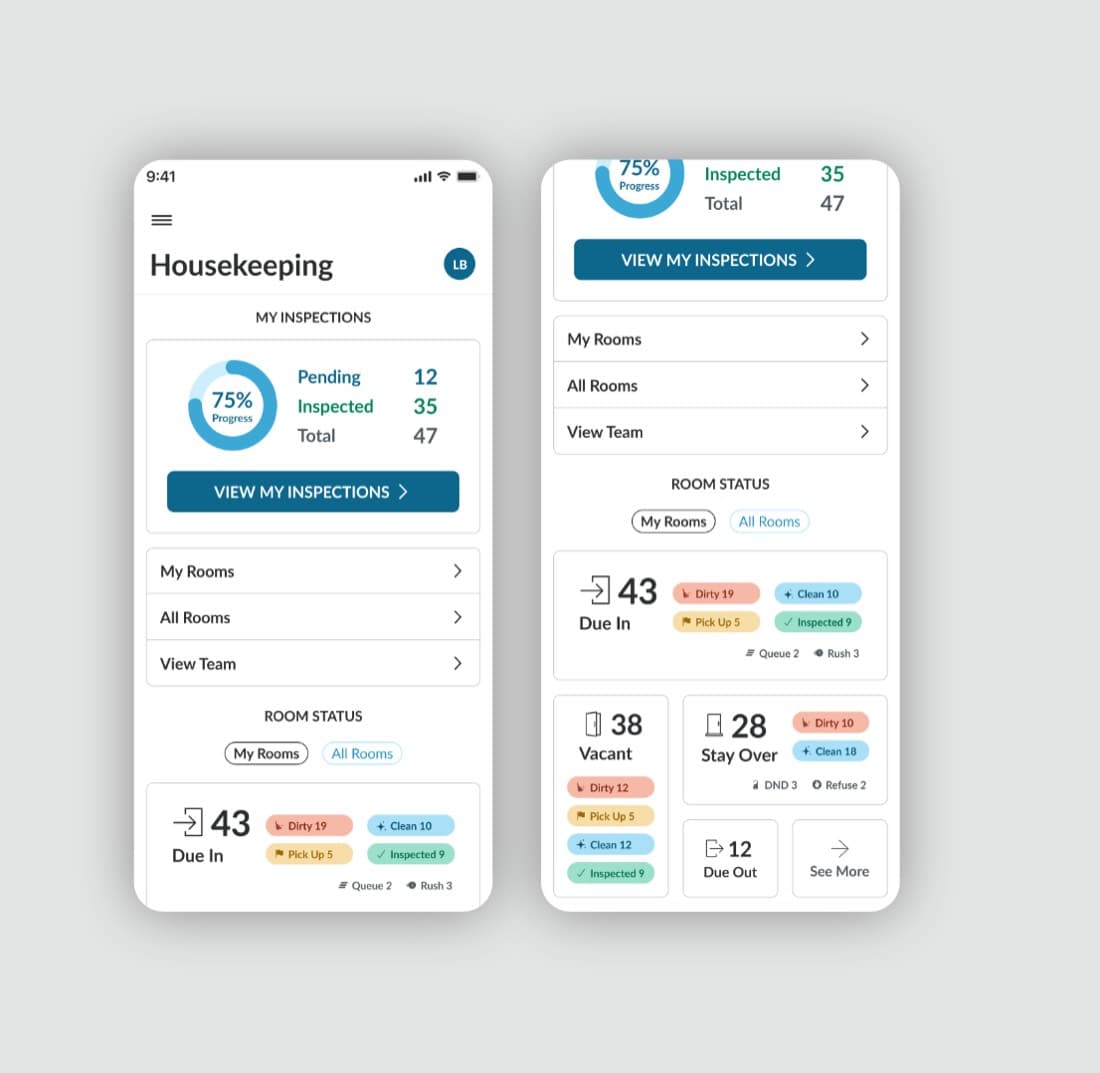
Housekeeping overview
A single progress view for staff — inspection status, room counts by state, and quick links to the team's work.
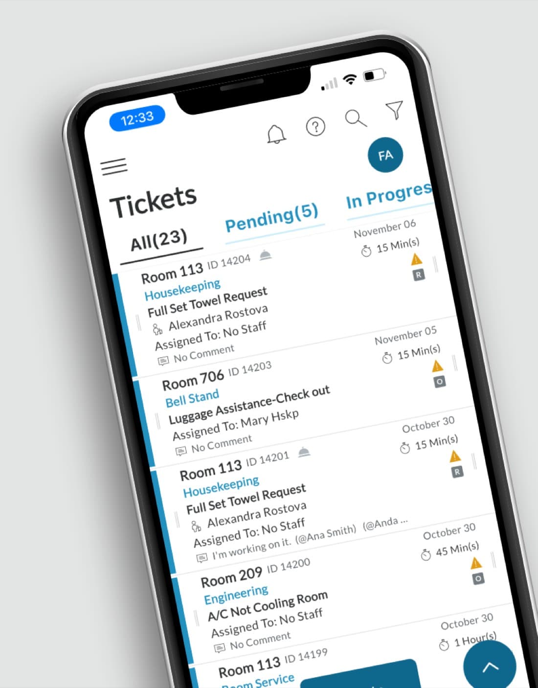
Tickets
Every request — housekeeping, engineering, bell stand, room service — routed through one filterable queue.
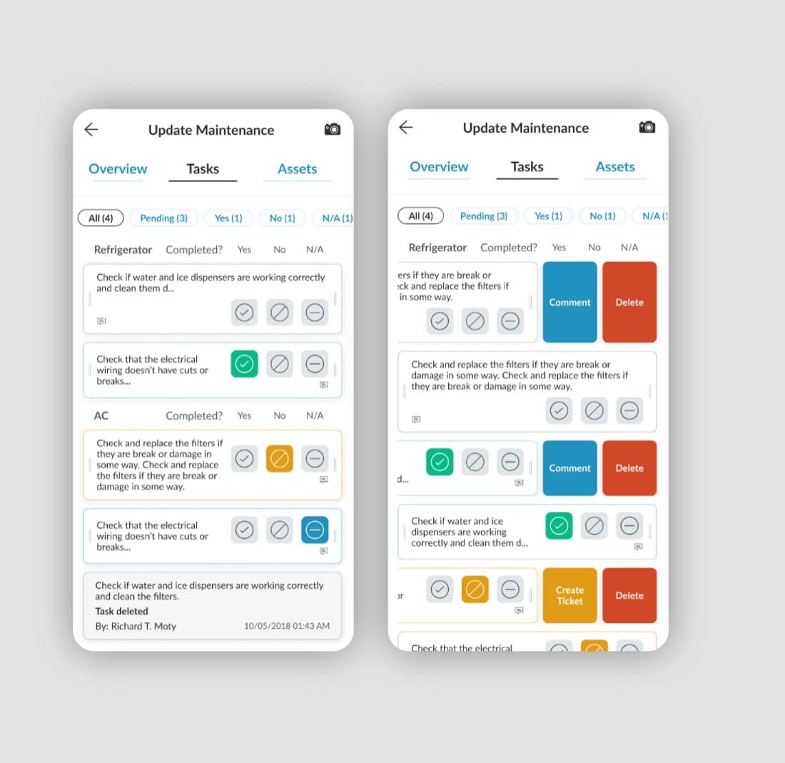
Maintenance
Maintenance tasks with inline comment, delete, and ticket-creation actions instead of a separate detail screen.
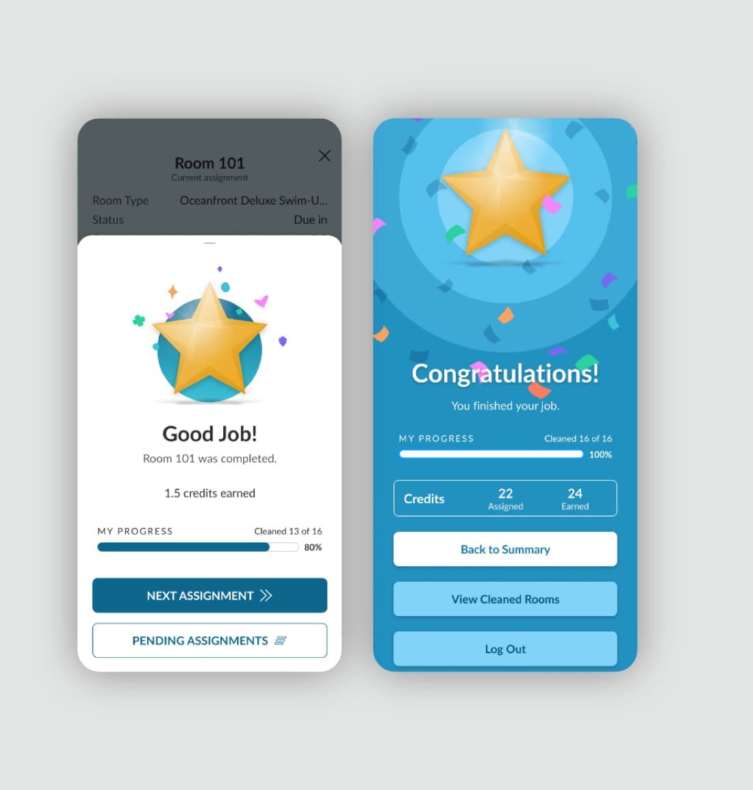
Completion moment
A clear completion screen with earned credits — the positive feedback the previous flow never provided.
Impact
Sabre's internal roadmap projects this redesign to cut housekeeping prep time by 25% — that figure comes from Sabre's own planning, not from measured production data.
Reflection
The hardest part of this project wasn't any single screen — it was resisting the urge to redesign everything. Staff had years of muscle memory built around Nuvola's existing structure, so the real design work was deciding what to leave alone. The pieces that made the cut — positive completion feedback, one supervisor view instead of several, clearer asset states — were the ones that removed friction without asking anyone to relearn their job.