Mi Movistar Web
Rebuilding a self-service platform's navigation around how customers actually think about their plan — not how the org chart is structured.
- Role
- UX Design Lead
- Team
- Product Owner, Scrum Master, 2 Developers, 2 Designers
- Timeline
- 4 months

An Information Architecture Nobody Asked For
Mi Movistar was Telefónica's self-service platform for managing plans and payments — but its structure had grown around internal categories, not the way customers actually thought about their account.
Process
- 1
Research
- 2
IA Mapping
- 3
Design
- 4
Prototype Testing
- 5
Validation
Approach
The redesign started with research, not wireframes: card sorting and task-prioritization surveys with real customers validated which services mattered most (billing and consumption ranked highest, support second) and shaped the new navigation categories directly. That data fed a full mental-model map of how customers actually group Movistar's services, which became the blueprint for the new information architecture — reorganized around the customer's semantics, not the org chart.
Guidelines
- Group navigation around what customers came to do, validated by card-sorting data — not by internal team structure.
- Separate account/profile information from plan and subscription details, which had been blurred together.
- Give billing, consumption, and plan management top-level priority, since research ranked them highest.
- Design mobile and desktop from the same responsive system, not as two separate builds.
- Add contextual cross-selling only where it's relevant to what the customer is already doing.
What Changed
A top bar with five sections and a sidebar with seven categories replaced the old menu structure, grouped by customer intent rather than internal service names. The home screen became a product-card dashboard ("Mis productos") with quick actions per plan — pay a bill, view an invoice, set up autopay. A unified "Mi Plan" view brought plan detail, consumption, contract, and requests into one tabbed screen across every service line. Contextual cross-sell banners and a support chatbot were added directly into the flow, in response to assisted support being the second-largest driver of dissatisfaction internally.
Interfaces
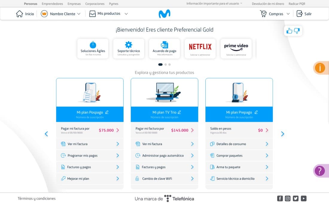
Home dashboard
Product-card dashboard replacing the old menu-first home — each plan with its own quick actions.
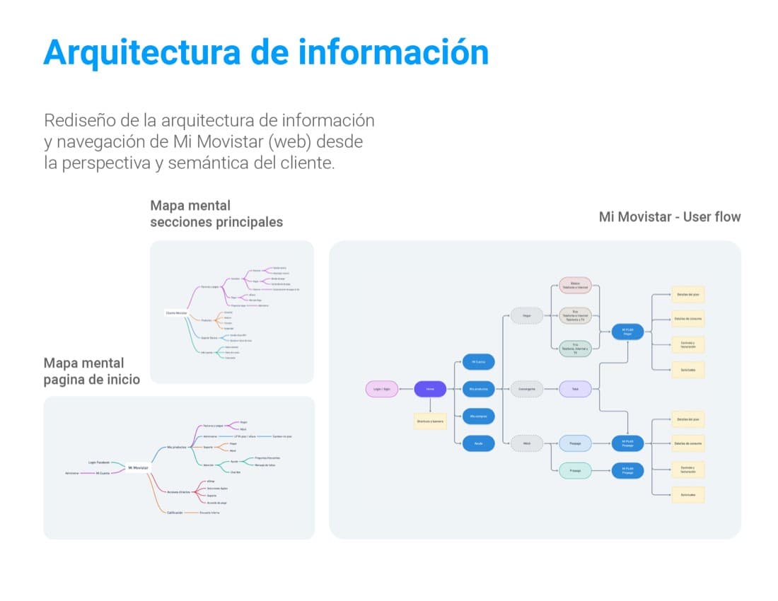
Information architecture
Mental-model mapping and user-flow trees built from card-sorting data, done from the customer's own semantics.
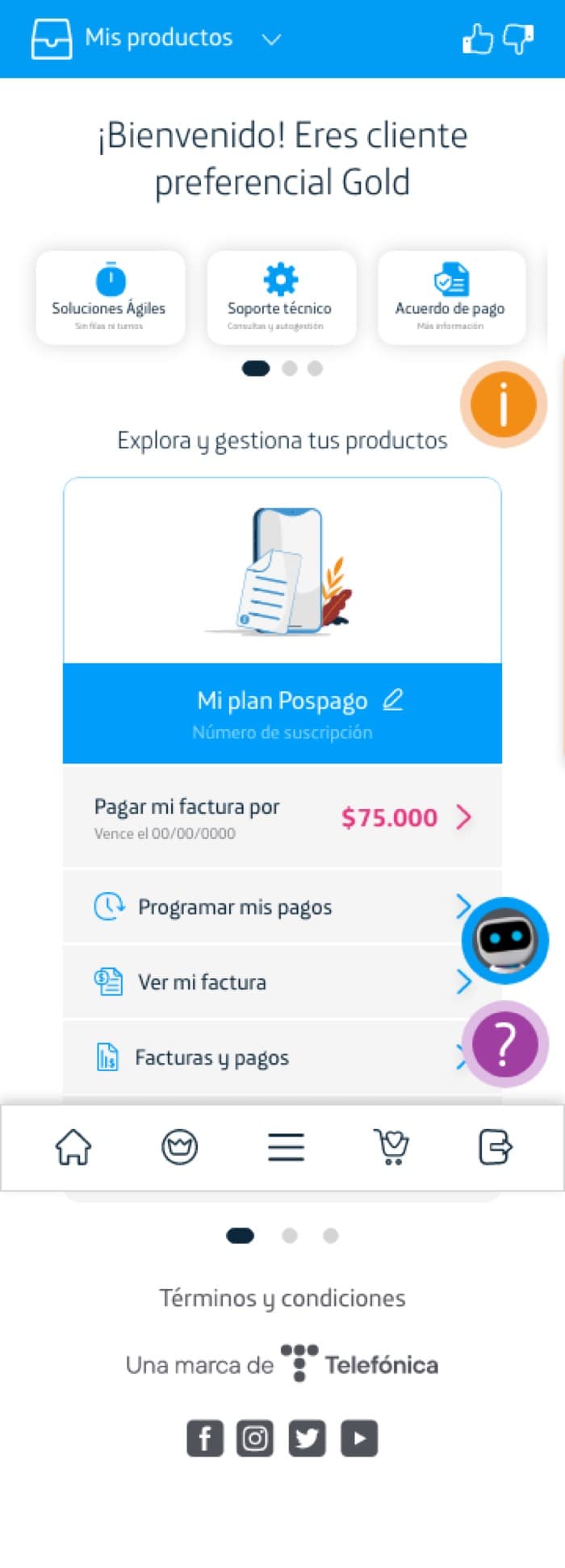
Mobile
The same product-card dashboard on mobile, from the same responsive system as desktop.
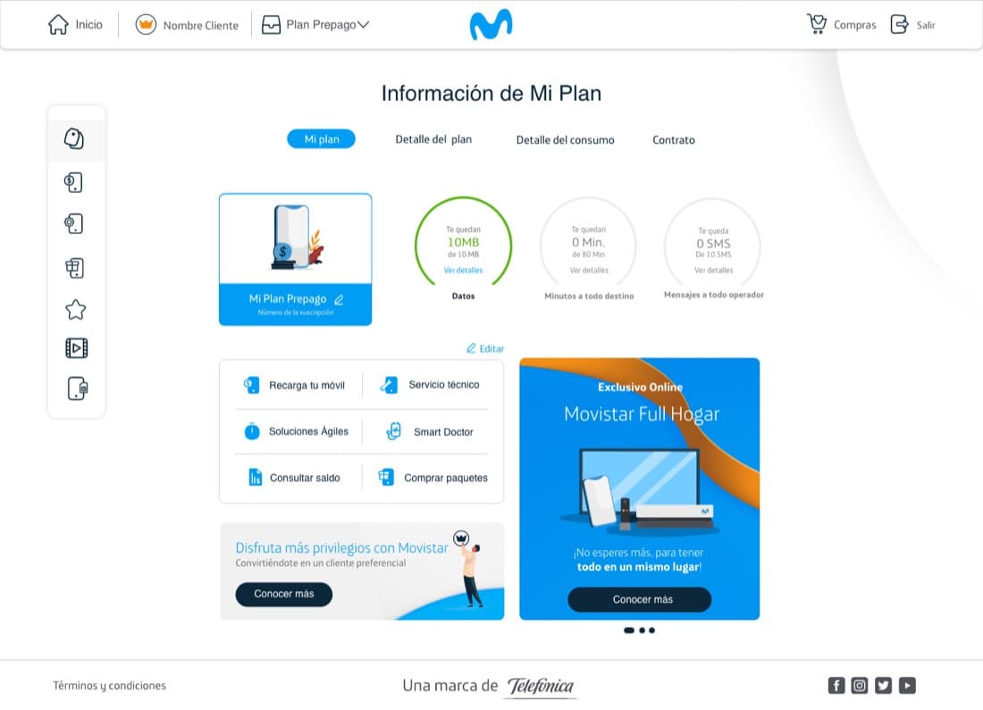
Mi Plan
The unified "Mi Plan" view — plan detail, consumption, contract, and requests in one tabbed screen.
Impact
These figures come from prototype usability testing conducted during the project, not from live production analytics.
Reflection
The instinct with a redesign like this is to jump straight to new screens. What actually moved the outcome was doing the unglamorous research first — card sorting isn't exciting, but it's the reason the new navigation matched how customers already thought about their plan, instead of just being a cleaner version of the same wrong structure.